
I will do my internship from September 2022
to March 2023. If you have any questions
about me or my projects, feel free to contact me.
Copyright © 2023 Marina Geltenbort. All Rights Reserved.


The user experience of goodreads has been criticized for its confusing information architecture, outdated design, and poor system for personal book recommendations. However, as the largest online catalog for books, it also has a range of functions appreciated by regular and intensive users. The opportunity for improvement was seen in integrating features such as the Homepage to make the user experience more pleasant and easier.

goodreads
redesign
This is the redesign of the application, which is "the world's largest site for readers and book recommendations".
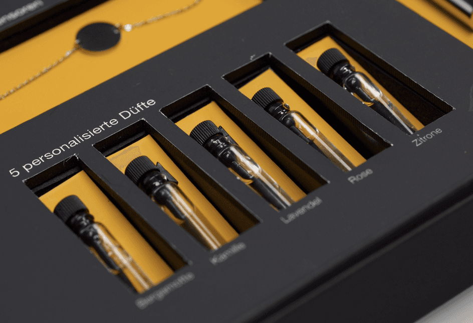
5 personalized fragrancies
Users can select and order these in advance from various fragrance families.
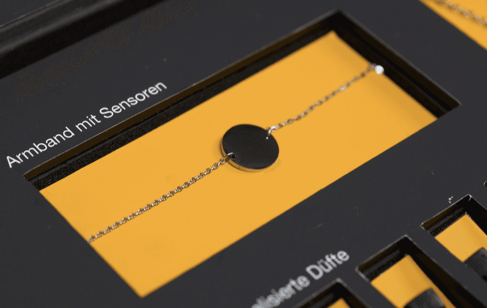
Wristband with a sensor
It measures electrodermal activity, which can be used to objectively determine a person's emotional arousal level.
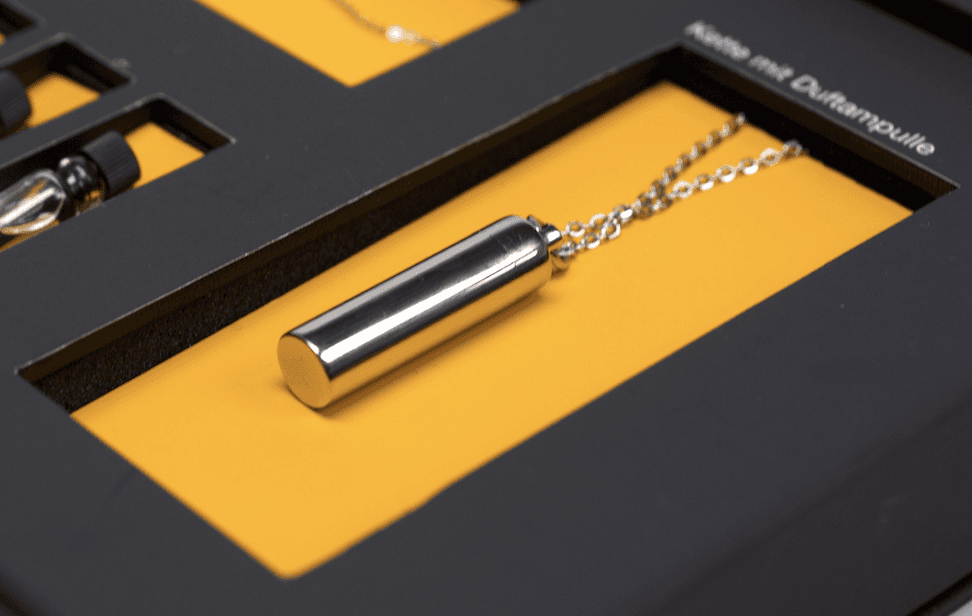
Necklace with a diffusor
In this the selected scent vial can be placed. It also contains a microphone for measuring emotional valence.
Disclaimer: This project is in no way associated with Goodreads, Amazon and their partners. It is only a semester project of the Hochschule für Gestaltung Schwäbisch Gmünd, in which the optimization and redesign of an existing application is in the foreground
The final result is a completely new redesign of the goodreads application. This is presented on a website. Our users are given the opportunity to quickly and easily note their reading progress on the homepage. In addition, they can view news about goodreads and possible book trends, as well as publications. If one would like to collect further book inspirations, one can receive this on the homepage, as well as the Bookpage. By interactively switching the tile and list view, as well as the brief glimpse into a book by hovering, makes the use experienceable and natural.

The opportunity for improvement was seen in integrating features such as the Homepage to make the user experience more pleasant and easier. The combination of greens and oranges, as well as the light beige background, are meant to emphasize a cozy mood reminiscent of reading in a wing chair in a big old library. The structured, yet familiar screenflow is an important part of our redesign.
Course
Application Design 1
Team
Lucia Hossainova
Philipp Minel Stäudle
Supervision
Sandra Raab
Application Design
Design Thinking
Redesign
Tags